Friday, 4 May 2012

SWOT Analysis

This is officially the last post I will be creating for this blog, which is a SWOT analysis table of myself.

Strengths

  • I work hard and try to do my best
  • I enjoy any module that is interesting and exciting
  • I have patience which you need for this module

Weaknesses

  •   I have never used 3D's Max before
  •   I do get worried about the final outcome
  •   I do not feel comfortable about learning something new that seems complex

Opportunities
 

  • I have taken a lot from this module that I hope to use later in life.
  • I have also taken from this module what 3D's Max is capable of and also what Adobe Premier does also.
Threats

  • I did not think I was going to have an animation that was worthy
  • I did not think that I was going to finish this module on a high, but how wrong was I

Everything Must Come To An End

This is going to be my last post for this module (apart from the SWOT analysis diagram I am going to do in the post after), which is going to be my evaluation of the module.

I think that I have really enjoyed this module and have had lots of fun with the software that I have been using. There have been some up's and down's but have managed to sort them out in the end, with it eventually all coming together and I am pleased with the final outcome. However as mentioned before there could have been some improvements but I think everything works well within the animation.

Overall I haven't really wanted this module to end but I am glad for the long break, and am pleased with the final animation, I have created an will be handing in, this is a great module and can't wait for next years 3D module's.

There Could Be Improvements

For this post I am going to comment on the improvements that I feel I could put in my animation.

Firstly the I feel that I have created a good attempt at my first animation in 3D's Max, as I have never used this software before, however I do feel there could be inprovements.

One improvement could be the lights, I think they need to be better placed as some parts of the animation are too bright.

Another could be the length of the animation, I think it might be a bit too short and some parts of the animation rushed, which means better planning should have been taken.

Next improvement could be the smoothness of the animation, where I have rendered the animation and attempted to join together using Adobe Premier it is slightly jumpy.  

Finally the biggest improvement that could have been made is the 'Pro Boolean' I have used in the animation, this is because I think that without it my animation could have been better, but unfortunately I needed it for my animation to work.


Overall though I still think that my first ever attempt at creating an animation in 3D's Max is till better than I thought it was going to be when I started this module.

Don't Stop The Music

This small post is going to be commenting on the sound track that I have added to my animation.

My first plan was not to add any music into my animation, however whilst I was creating my animation I thought that it was missing something, that something to make it better, which I eventually realised was sound.

I decided to add a sound track that have a war/battlefield feel to it, and was forever searching for that right sound, and I believe I have got there with a rock song.

I added it through Adobe Premier which was very simple just needed to drag and drop, then shorten the sound to the right length that I needed and hey presto we have a finished animation with sound.

The sound that I have used is a personal sound track however I will reference it

Soundgarden. (2012) Live To Rise, Soundgarden. [Digital audio file], iTunes. Available from: <apple/iTunes> [Accessed 2 May 2012].

Why Is It So Dark?

For this post I am going to comment on the lights that I have inserted into my animation.

I originally planned to not have any lights in the animation, however I felt that having them within the animation made it clearer to see for the audience.

The lights that I used where the 'omni' lights, these are not the best lights but felt that is all that was needed, but I did have to put in two or three lights for each render, because the light didn't stretch over the whole stage.

The lights also don't move they are static as I didn't think they needed to be animated in anyway.

However I do feel that the lights could have been placed better as some parts of the animation I feel are too bright, but this will be explained in more detail in another post.

I will screenshot an example of how the light is working in the animation.


This screenshot is of the lights that I have used in my animation as you can see the shadow on the top of the tower.

1000 Words Paints A Picture

This small post is going to be commenting on the text that I have used with my animation.

I decided to add to my original idea and make the animation more humorous by adding in a couple words of text, for example the crossbow and the catauplt are having a battle and I inserted the text 'Champion' for the crossbow and the words 'Contender' for the catapult.

The text was simple to create, just typed what I wanted into 3D's Max, placed the text where I wanted it to show by rotating and moving the text into position. I also had to extrude the text to make it 3D, but I do think that by using the text it fits within the animation and seems to be funny. Below is a screenshot of an example of the text that I have used within my animation.


This screenshot is of the text that I have used in my animation you have to watch the whole animation to understand

And Were Rolling!

This post is going to comment on the camera that was used within the animation.

For the animation I was going to use multiple camera's however I realised I would need to do multiple camera's and didn't feel I had the time to fit them in the animation. However once I had come to the end of animating I realised I could have done my original plan as I needed to do multiple renders anyway, but this will be explained in the render post which is to follow.

However back to camera's for my animation, I used a target camera, as I felt using a free one wouldn't capture what I really wanted, with a target camera I could position exactly what I wanted the audience to see, and I think I have achieved this quite well. I will screenshot a camera view from the animation.


This screenshot is of a camera view from my animation, I zoomed out at this point so that you could see the catpult fall apart

It's Model Time

This post is going to be commenting on the three models that I created and what they are doing within the animation that I have created.

Firstly I will comment on the Giant Crossbow Model. For this model I followed the storyboard that I had created and wanted to show off the destructive power of the crossbow. This was achieved by having the crossbow take a shot and destroy the catapult model, there was not a lot of animation that needed to be done to the crossbow however the animation that needed to be done was still very fiddly. However I am still pleased with how the crossbow animation has turned out.

The animation that I used on the crossbow was to make the arrow fire from the crossbow. I could have just made the arrow fire, but I thought that was too easy and very boring, so I decided to animate the turning wheel and the rope that are attached to the crossbow (this was the fiddly part). I kept moving the turning wheel in a rotation motion so that it looked realistic, also I timed it so that the rope moved forward, with finally the arrow shooting off from the crossbow once the roped had moved forward enough. I will screenshot what I have animated on the crossbow so that it makes more sense.


This screenshot shows the crossbow, you can see the turning wheel and the rope which I have animated to move


Next is the catapult, this model was the most tricky to animate as it has a few moving parts and if I had just left them without any movement, the animation would have been very boring and not very entertaining. Even though the catapult was the most difficult to animate I am still very pleased with how it turned out.


The animation that was needed for the catapult was, the catapult needed to fire at the crossbow and cause some damage. So I needed to animate the handle, the turning wheel, the arm and the ball all in one single movement. With the ball then causing damage on the tower.


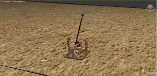
The handle, arm, turning wheel and ball all needed to be rotated at the same time on the timeline so that it seemed realistic, and I think it does. Again I will screenshot the catapult so that it is clearer to understand.


This screenshot is of the catapult which you can see the arm has moved from top to bottom, the turning wheel, the handle have been animated to move also

The last model to comment on is the tower, this model was not really animated in anyway. I only had to 'Pro Boolean' out the catapult's ball so that it looked like the ball caused some damage to the tower.


This however did start to become an annoying problem as I found out that when something is 'Pro Booleaned' in an animation, the geometry starts to go wrong further down the animation, which became very annoying. Once I 'Pro Booleaned' out the ball I found it disappeared from the rest of the animation so I needed to clone the ball and time it within the animation with the 'Pro Boolean' which took a very long time.


Furthermore when I started to move the cloned ball into a better position it ended going in the wrong position when the animation was played, however I eventually fixed it and am happy with how it has turned out. Again I will screenshot the tower for better understanding.


This screenshot is of the tower as you can see there is a hole in the tower which is the 'Pro Boolean'

All Coming Together

For this post I am going to comment on the rendering that I have had to do within the animation.

Firstly I had finished my first attempt at an animation and was ready to render, I selected all the options that were needed apart from the compression, as the video needed to be uncompressed which I didn't do and found out once I had rendered the animation.

So I had to re-render and remebered to slect uncompressed this time. Luckily my animation didn't take long to render, unlike my colleges where there's took five hours to render!!!

Eventually the second render attempt finished but once I played it through the geometry went all wrong, and I assumed this was because of the 'Pro Boolean' so I went for a third attempt but did the render in chunks which eventually worked after the third attempt.

Next I had to import the files that I had render into Adobe Premier so that I could join them together which wasn't too difficult seeing as I hadn't used it before.

Furthermore whilst in Premier I added a static title at the end and the beginning of the animation just to tell the audience who's animation it was.

But I think I have eventually got there and am almost ready to hand in getting a little nervous now!

Wednesday, 2 May 2012

Taking In The Scenery

This post is regarding the scenario that the animation I am creating is going to be in. I was given a brief to work from, which was firstly to create three models based around 15th Century Italy and Leonardo Da Vinci and to create an animation to fit this brief too.

The three models where of Leonardo Da Vinci's inventions the only problem was to think of a scenario that matched the brief, and I decided to go with an animation that showed of the power of these inventions, which gave me the idea of a scenario being away from any city's of Italy, instead being part of a 15th century battlefield.

However I must admit that the scenario is not greatly detailed and I feel that this lets the animation down, furthermore this might have been due to me paying more attention to the animation of the models and not the surrounding area of the models.

I decided to create a cylinder for the environment floor, this was because when you look at the horizon the world is round, and if I had just used a pre-fixed plane within 3D's Max then the horizon would have been flat not round hence the use of a cylinder, then I just added a sandy texture with a bit of bump added. The reference for this texture is:

Sand Terrain Texture - n.d. Sand Texture, [electronic image] Available at: <http://www.google.co.uk/imgres?q=sand+texture&hl=en&sa=X&gbv=2&biw=1184&bih=666&tbs=isz:l&tbm=isch&tbnid=018t48LRViNrTM:&imgrefurl=http://www.imageafter.com/image.php%3Fimage%3Db1dirt005.jpg%26size%3Dfull%26download%3Dno&docid=ZWFZYoad6VJSzM&imgurl=http://www.imageafter.com/dbase/textures/grounds/b1dirt005.jpg&w=1600&h=1200&ei=3UeRT-SCLeKV0QXsr9nVAQ&zoom=1&iact=hc&vpx=882&vpy=252&dur=2571&hovh=194&hovw=259&tx=63&ty=101&sig=117830732039765713861&page=1&tbnh=118&tbnw=155&start=0&ndsp=18&ved=1t:429,r:11,s:0,i:131> [Accessed 12 April 2012].

The other texture that I have added for the scenario is the sky. I decided to add this because if I had just left it blank the animation would have been boring and not realistic however by adding in the sky texture I believe it has made the animation more realistic. The reference for this texture is:


Blue Sky Texture - 14 August 2008, BLUE SKY, [electronic image] Available at: <http://thedangerousofficial.blogspot.co.uk/2008/08/blue-sky.html> [Accessed 20 April 2012].